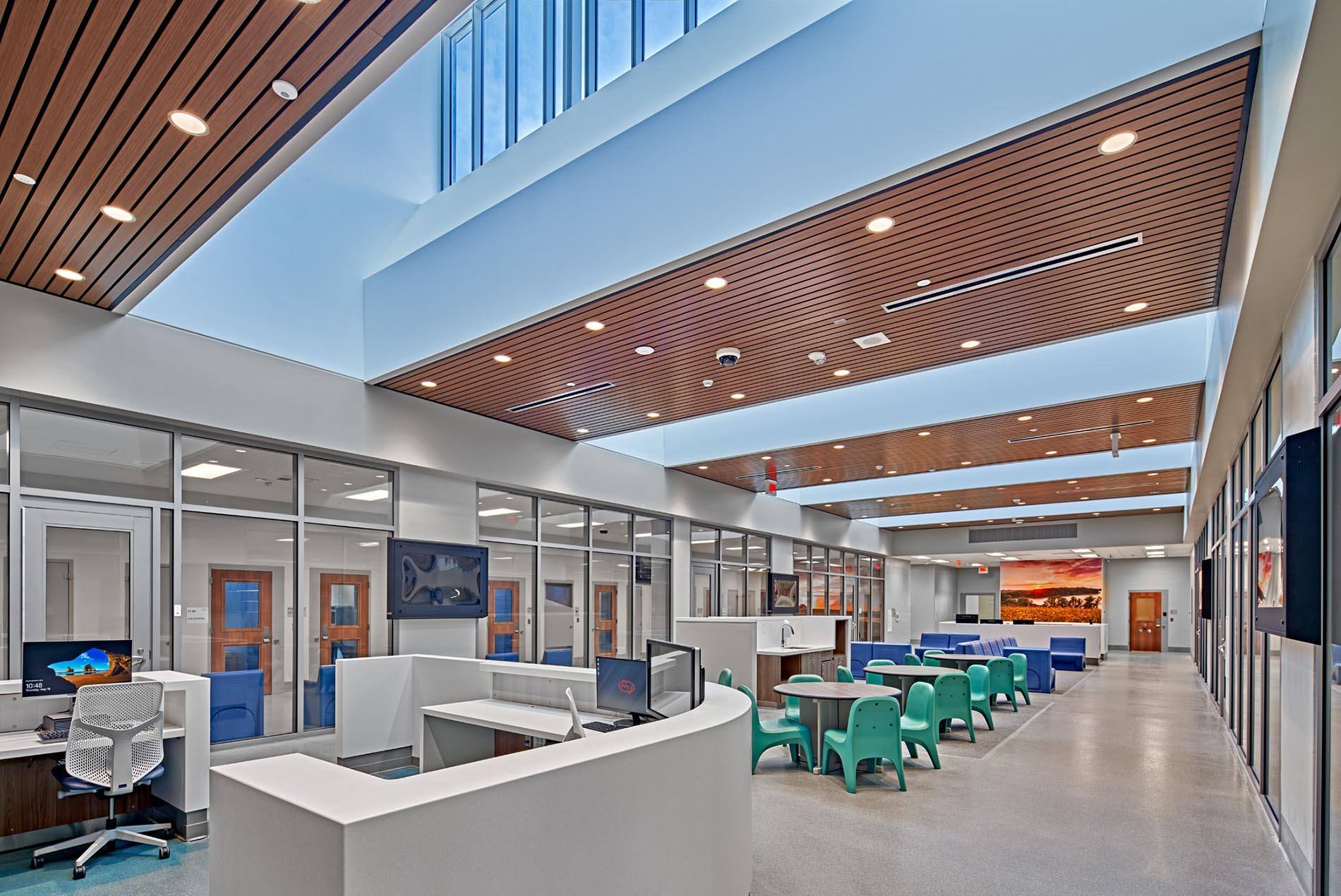
read caption +
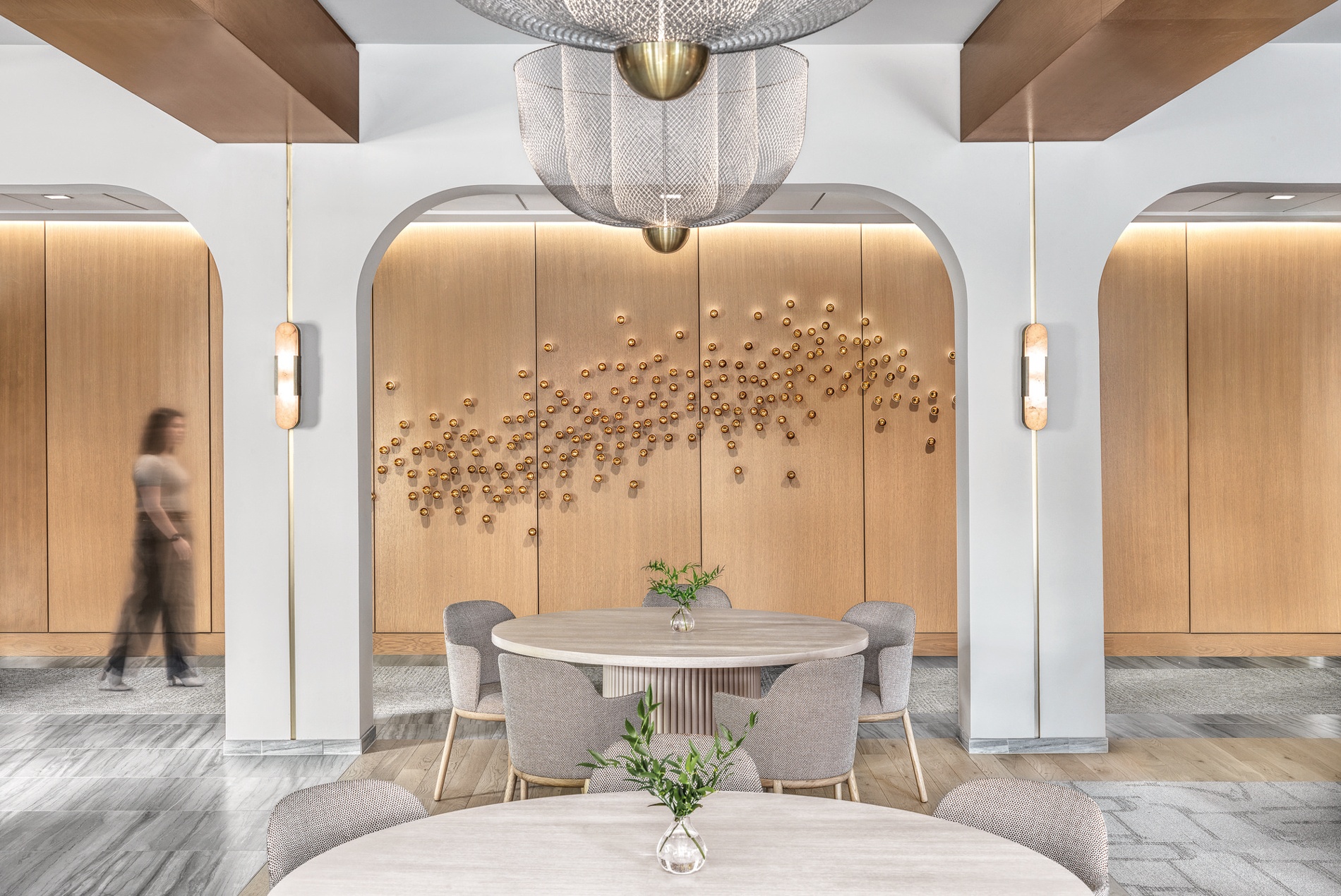
A soft color palette informed the interiors with rich textural materials, warm wood tones, metallic accents and charcoal elements providing a slight contrast.
This site uses cookies – More Information.

HOK worked with the client to brainstorm names that would resonate with the community, reflect local history and attract young professionals and families to call The Clover their home. The team developed multiple concepts, from names that highlighted local history to those that reflected the residence’s modern elegance.
The branding and logo needed to express sophistication, community, history and connection. The team conducted multiple studies on visual identities, creating dozens of different branding options to find the right fit.

Together, the team landed on The Clover, featuring four circles or “leaves” that represent the four communities—Central, Tower Hill, Olive and Stratmann—which united to form Olivette in the 1930s. The logo capitalizes on the friendly curvature of lowercase letterforms to create the wordmark and incorporates an abstracted four-leaf clover made by the shapes of the O and C.
The joining of these letterforms represents the strong connection to the Olive Crossing community fostered by this residence. The mark welcomes the viewer with friendly asymmetry, reflecting the brand’s classic, sophisticated and inviting personality.

HOK’s Experience Design team created a brand guide for The Clover. The guide outlines primary and secondary logos and appropriate occasions for each use. It also introduces a distinctive brandmark. To establish a cohesive brand image, the document specifies typography, colors, patterns and more.
The guide also provides practical brand application examples ranging from branded key chains and water bottles to web apps.

The Clover’s branding and interior design appeal to modern, sophisticated residents looking to move into the growing new development. Inspired by mod fashion and pop culture, the interiors team created a timeless yet contemporary design.

The client wanted to create a truly exceptional living experience through every detail of the space—from artwork and amenities to furniture and finishes.
To provide a sophisticated entry that blends art and architecture, our interiors team selected a striking chain link sculpture with gradating metallic tones of gold, copper and silver. This sculpture is suspended from the entry lobby ceiling, creating a luxurious ambiance for residents entering the building.
Iconic artwork of Audrey Hepburn, made from recycled bottles, sits above the entryway and is visible from the second-floor balcony.


HOK’s design team carefully curated The Clover’s interiors, infusing them with warmth and personality while adding modern touches for surprise and delight.
In addition to the Audrey Hepburn artwork in the lobby, unique images of Marilyn Monroe and Muhammad Ali grace the club room and fitness center, respectively.


The Clover’s luxurious amenities enhance the residents’ living experiences, acting as a sanctuary from the hustle and bustle of everyday life:
Update your browser to view this website correctly. Update my browser now